Skift Take
The map's original designer was one of the first to realize that transit maps need to tell a different story than other maps and made choices that others have copied for eight decades.
As the world's oldest subway, better known as the Tube, celebrates its 150th birthday, here's a familiar but gently tweaked reminder:
Mind the map.
The London Underground is justly famous as a defining feature of the British capital, a wonder of the modern age that whooshes millions of riders around the city every day.
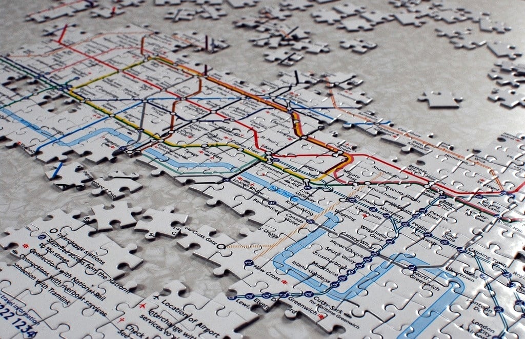
But a London institution that may have an even tighter grip on the public imagination is having a birthday too (its 80th): the Tube map.
Instantly recognizable the world over, the simple yet elegant diagram of the 249-mile subway network is hailed as one of the great images of the 20th century, a marvel of graphic design. Its rainbow palette, clean angles and pleasing if slightly old-fashioned font (Johnston, for typography buffs) have endured since hurried passengers first stuffed pocket versions of the map into their raincoats in 1933.
"It's a design icon," said Anna Renton, senior curator at the London Transport Museum. "You shouldn't use that word too often, but it really is."
It's been copied by other cities and riffed on by artists and satirists. It's omnipresent in souvenir shops, plastered on mugs, underwear, mouse pads and tote bags, on sale next to the "Mind the Gap" T-shirts.
Perhaps most impressively, the image is stamped onto Londoners' brains. If the Tube is how people get around London, the Tube map is how many conceive of this sprawling city, their sense of its geography shaped -- and sometimes warped -- by the drawing's streamlined, reductive lay