Skift Take
What's not to love about Saul Bass? Possibly when lesser designers try to remix his work for the future and come out with a middling result.
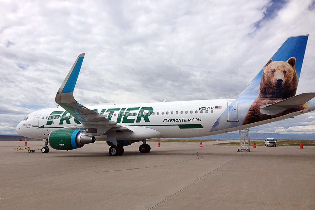
Seeking to position itself as an airline that offers super cheap fares but still cares about customer satisfaction, Frontier Airlines unveiled a new branding strategy on Tuesday, one that plays up the carrier's long history.
The core of the new campaign is a return to a stylized 'F' the airline used in the late 1970s and 1980s. It was designed by Saul Bass, who also came up with United's former 'U'-shaped symbol known as "The Tulip," as well as an earlier logo for Continental. As part of Frontier's new brand look, the 'F' will be painted on aircraft, along with an italicized version of the airline's name. The italics font, which was not part of the original design, is meant to show Frontier is moving forward.