What’s Behind Air Canada’s New Look and New Branding

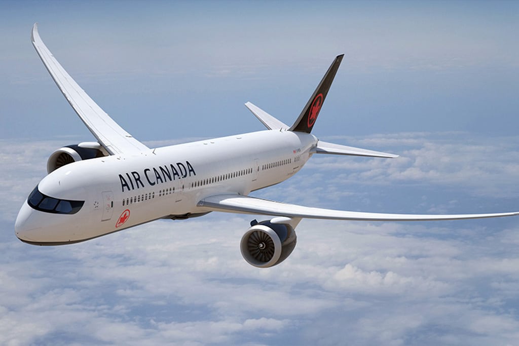
Photo Credit: A rendering of Air Canada's new design, part of a broader rebranding process. Air Canada
Skift Take
Air Canada is taking a page out of the past to make a larger statement about its role in aviation in modern times.
A refreshed livery for a national carrier isn't always just a fresh coat of paint. It has implications for business strategy, employee morale, and national pride — as well as modernization.
Skift recently caught up with Tyler Brûlé of Monocle and London-based branding consultancy Winkreative to discuss his company's work on Air Canada's newly refreshed mainline and regional fleet.
The new livery is crisp, elegant, and a distinct departure from the light blue "toothpaste livery" of old. It reads as a statement of intent for Canada on the world stage. Less comfy cozy, more business and more confidence sitting alongside the best carriers in the world on far flung runways.
The colors have changed to black and white, with red Maple Leaf accents and a distinctive black belly which makes the plane instantly identifiable on a final approach. It's subtle, non flashy yet impactful work that maps directly to Winkreative's other projects in aviation, notably the early